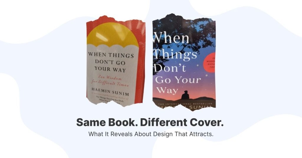
Two versions of the same book sit on the shelf — same title, same author, same pages inside.
But when placed side by side, they feel completely different.
One cover bursts with color and movement, its bold typography practically jumping off the shelf.
The other is plain, quiet, and understated, with elegant serif fonts and plenty of white space.
Walk past these books in any bookstore, and you’ll witness something fascinating: different people will gravitate toward different covers of the exact same content.
The visually expressive reader reader might reach for the vibrant cover with flowing script, while the literary fiction enthusiast picks up the minimalist design.
Neither is making the “wrong” choice — they’re simply responding to visual cues that align with their expectations, preferences, and identity.
The Invisible Force of Design Alignment
That’s the power of alignment in design. One isn’t better than the other — they simply speak to different readers.
This phenomenon reveals something profound about how we make decisions, often subconsciously, based on visual and emotional resonance.
The same principle applies to every aspect of your business presence.
Your brand, website, and sales funnel don’t need to please everyone. In fact, trying to appeal to everyone is often a recipe for appealing to no one.
Instead, they only need to speak directly to those who are most aligned with your message, energy, and offer.
Consider two fitness coaches with identical qualifications and similar programs.
Coach A uses bright neon colors, high-energy photography, and bold sans-serif fonts throughout their marketing.
Coach B opts for muted earth tones, calm lifestyle imagery, and elegant typography.
Both approaches are “correct,” but they’ll naturally attract different clients.
The person seeking intense, high-energy workouts will feel drawn to Coach A’s aesthetic, while someone looking for mindful, sustainable wellness might resonate more with Coach B’s approach.
Beyond Surface-Level Aesthetics
Design isn’t about being “louder” or “trendier” — though those approaches work perfectly for some brands and audiences.
True design alignment goes much deeper than surface-level aesthetics. It’s about creating visual and structural harmony with your ideal client’s worldview, values, and emotional state.
When your design is properly aligned, several things happen:
Recognition becomes instant:
Your ideal clients don’t need to study your website or social media to “get” what you’re about. They feel an immediate sense of familiarity and belonging.
Trust builds faster:
When people see their values reflected in your visual choices, they’re more likely to trust that you understand their needs and challenges.
Decision-making accelerates:
Aligned design removes friction from the buyer’s journey. Instead of wondering “Is this for me?” your ideal clients think “This is exactly what I’ve been looking for.”
Premium positioning becomes natural:
When everything feels cohesive and intentional, clients perceive higher value — even before they fully understand your offer.
The Cost of Misalignment
On the flip side, misaligned design creates confusion and hesitation. Imagine a luxury financial advisor using comic sans fonts and neon green backgrounds, or a playful children’s brand presenting itself with stark corporate imagery.
The disconnect between visual presentation and actual value creates cognitive dissonance that drives potential clients away.
Misalignment often happens when business owners chase trends without considering whether those trends serve their specific audience.
The result is a brand that looks “designed” but doesn’t feel authentic or trustworthy to the people who matter most.
Finding Your Visual Voice
So how do you discover what alignment looks like for your brand? Start by getting intimate with your ideal client’s world. What do they value? How do they see themselves? What aesthetic choices do they make in other areas of their life?
If your ideal client values tradition and stability, your design should reflect timeless elegance rather than cutting-edge trends. If they’re innovators and early adopters, your visual approach can be more experimental and bold.
The key is consistency across every touchpoint. Your website, social media, email templates, and even your Zoom background should all tell the same visual story.
This doesn’t mean everything needs to be identical, but there should be a clear thread connecting all your design choices.
The Alignment Advantage
When you nail design alignment, marketing becomes easier. You’ll find yourself attracting more qualified leads, experiencing fewer “tire-kickers,” and commanding higher prices.
Your ideal clients will seek you out because you feel like the obvious choice — not just a random option among many.
Remember the two book covers. Both publishers understood their audiences deeply enough to design covers that would resonate.
They weren’t trying to create the “best” cover in some objective sense. They were creating the right cover for their specific readers.
Your business deserves the same thoughtful approach. Every color choice, font selection, and layout decision should serve the larger goal of creating genuine connection with the people you’re meant to serve.
Ready for Alignment?
The most successful brands aren’t always the loudest or the most visually stunning. They’re the ones that create the deepest sense of recognition and belonging for their ideal clients.
They’re the book covers that make the right people stop, pick them up, and think, “This was made for me.“
Want to check if your digital presence is aligned?
Download the Website Self-Check Freebie — available now in the Vault.
Discover exactly where your current design might be creating friction, and get actionable steps to bring everything into perfect harmony with your ideal client’s expectations.